Behind the Craft: RSPB - Time Flies
Aardman Director Bram Ttwheam talks us through the making of Time Flies – our watercolour style animated film for the RSPB, produced in collaboration with creative agency Catsnake.
THE BRIEF
It was a company called Catsnake who first approached us with this project. They do a lot of work with charitable organisations and produce pieces with strong narratives and a lot of heart.
The RSPB is an organisation with a proud history dating back over a hundred years. They’ve worked tirelessly with public and official bodies to mitigate damage and habitat loss caused by human activity. They also educate and inspire new generations in ways that are inclusive and future facing. Basically they care deeply and want to protect, preserve AND create new reserves for wildlife that we can all enjoy.
The brief had to communicate all this and remain engaging throughout which is quite a challenge in a 60 second spot. Catsnake came up with the concept of a time traveling bird which was a very rich seam to mine and lent neatly to a catchy title. We chatted about the possibilities and how animation could help a piece of such scope. It was a far ranging conversation that included many subjects like style, time-lapse, symbolism and much more. It was a great way to all get on the same page, share creative ideas and establish a healthy working relationship.
THE STORY
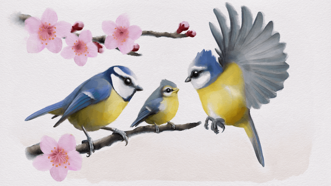
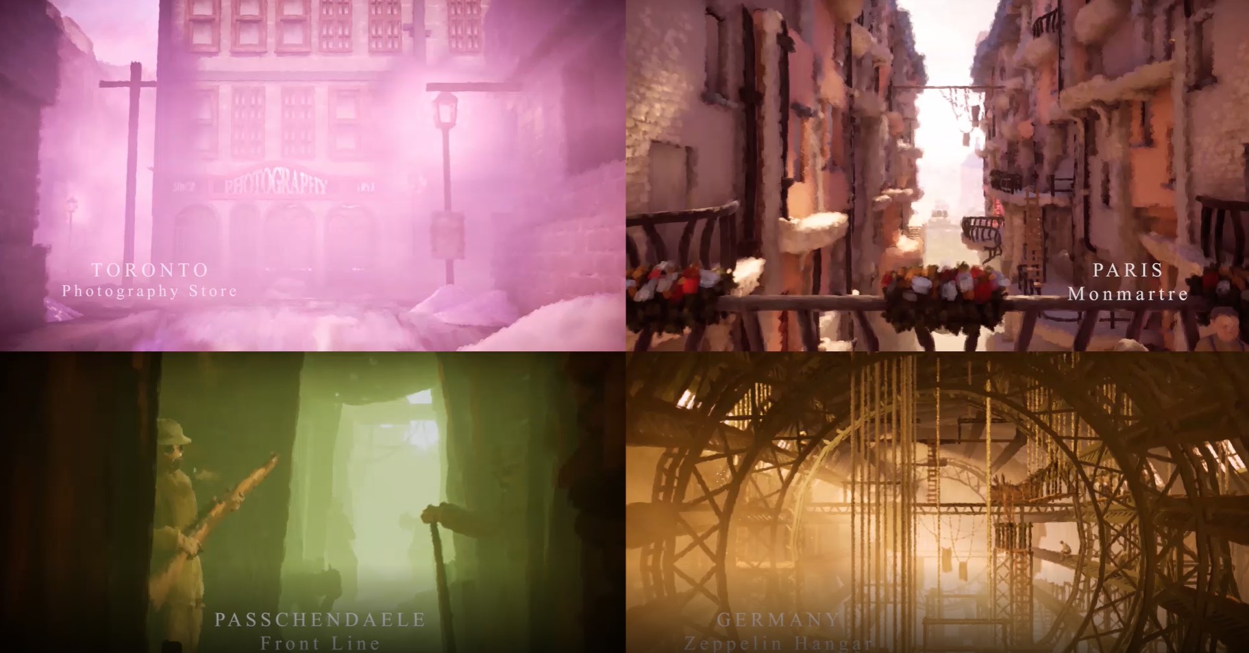
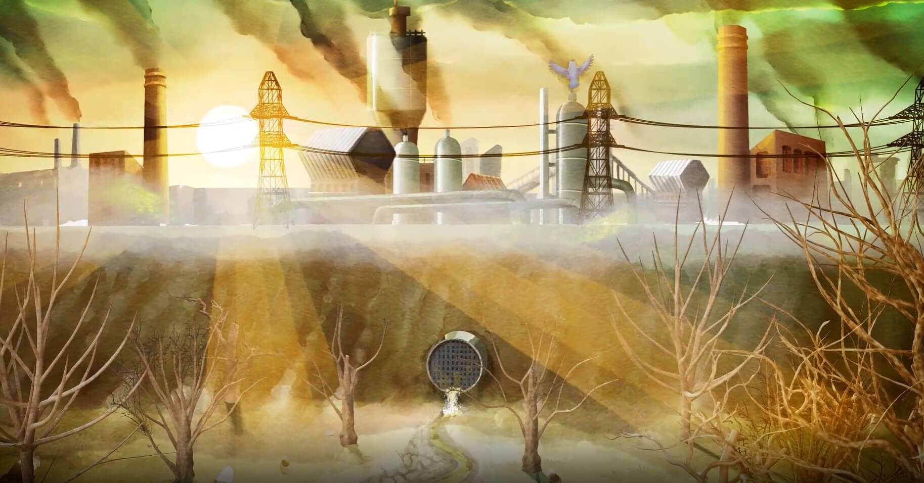
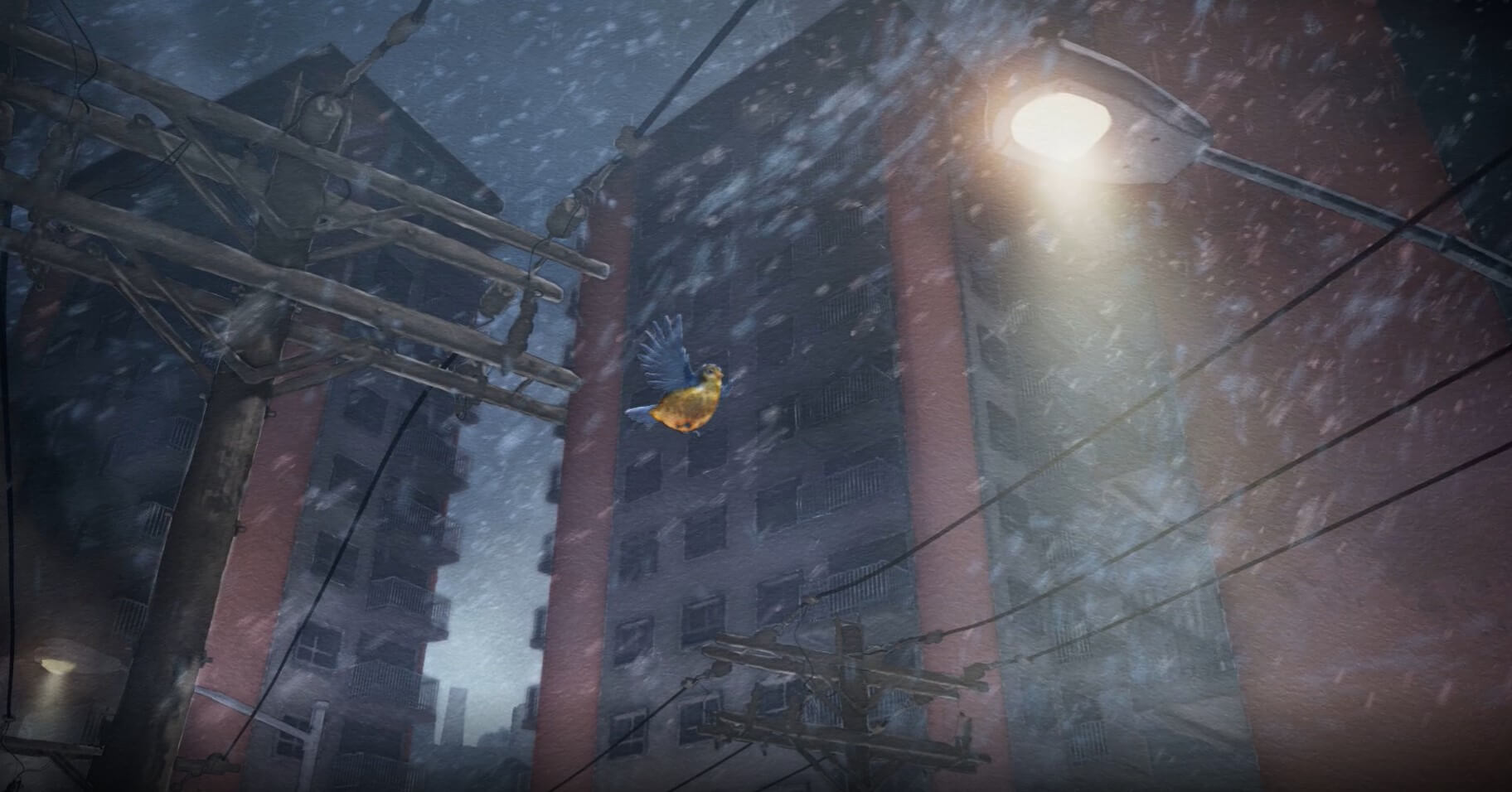
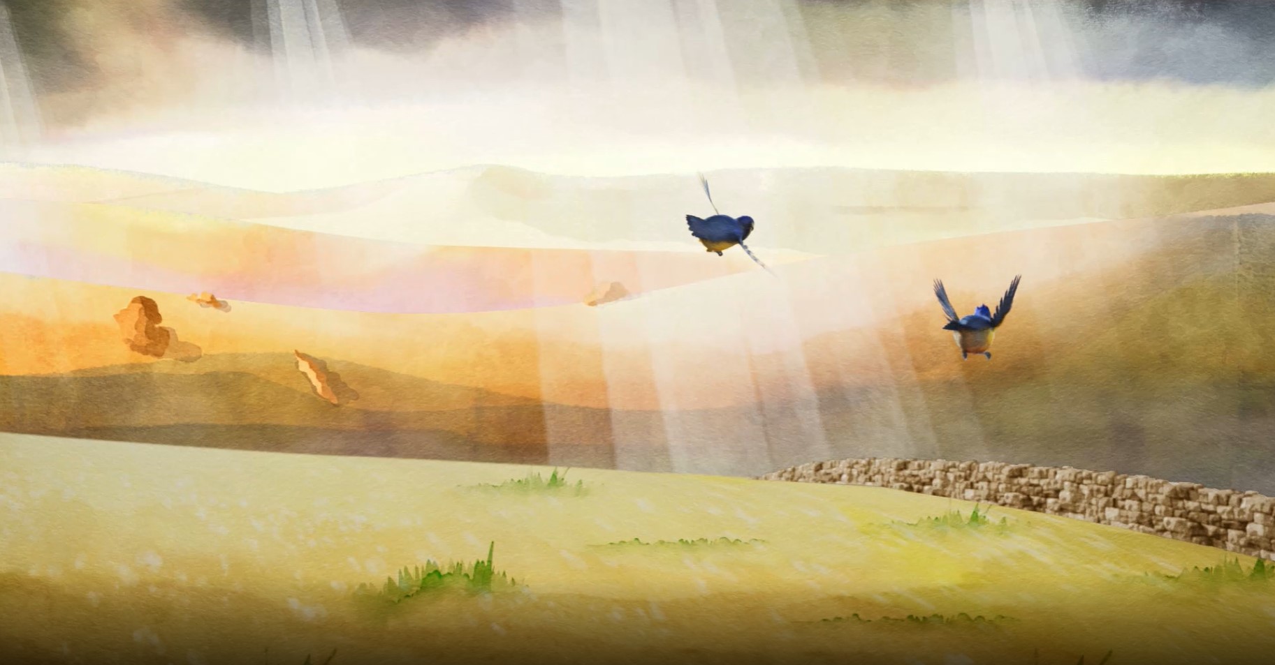
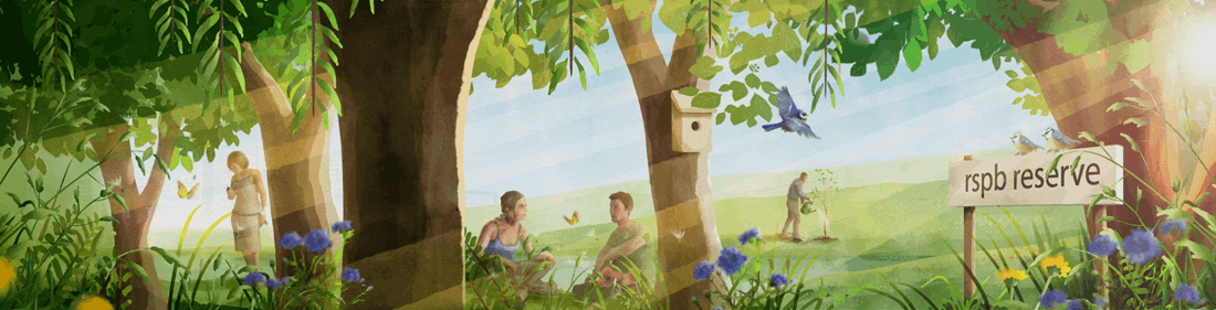
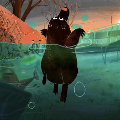
In the spot we tell the story of a fledgling who, encouraged by its parents, takes its first flight. Desperately trying to keep up with its parents we see through its eyes and the impact humans are having on the world. The landscape rapidly changes as though it’s flying through the ages to remain with its family. These changes provide obstacles and dangers to our little hero. Urban creep, technology, travel and pollution are separating the bird from its home. At last it spies a small garden – an oasis in a hostile world. The garden represents the small things we can all do to help and how the RSPB can offer guidance. Once refreshed the fledgling is able to continue the journey to a nearby future and a home in environments renewed by the work of the RSPB.
THE APPEAL
I found this project particularly attractive for a number of reasons. The narrative core being so rich and the chance to play stylistically were hugely appealing, but more than that it’s a cause I personally believe in. As a child I was a keen bird spotter and I’ve an abiding love for nature. The RSPB were an influence on me personally and I enjoy sharing my knowledge with my own family. Now, more than ever, this kind of work is vital. Every time we lose a species or a habitat is destroyed that loss will be felt by future generations. The damage is far more insidious than it may at first appear.
THE CHARACTERS
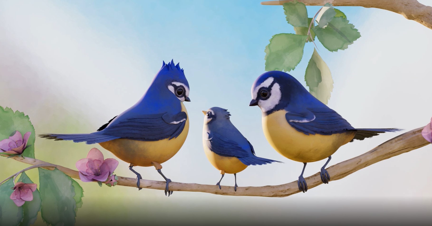
One of the earliest decisions was which species the bird should be. It had to be something easily recognisable to everyone and not just bird spotters. Robins were discussed but their association with Christmas meant that a blue tit seemed more fitting. They’re so familiar, cute and recognisable; they were perfect.
THE PROCESS
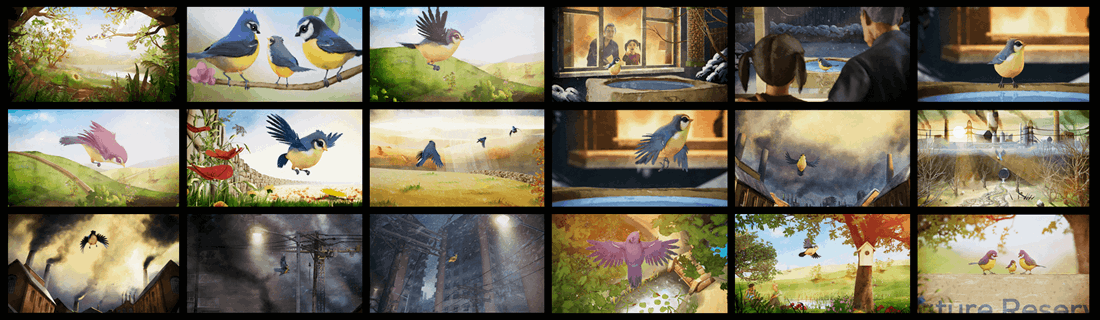
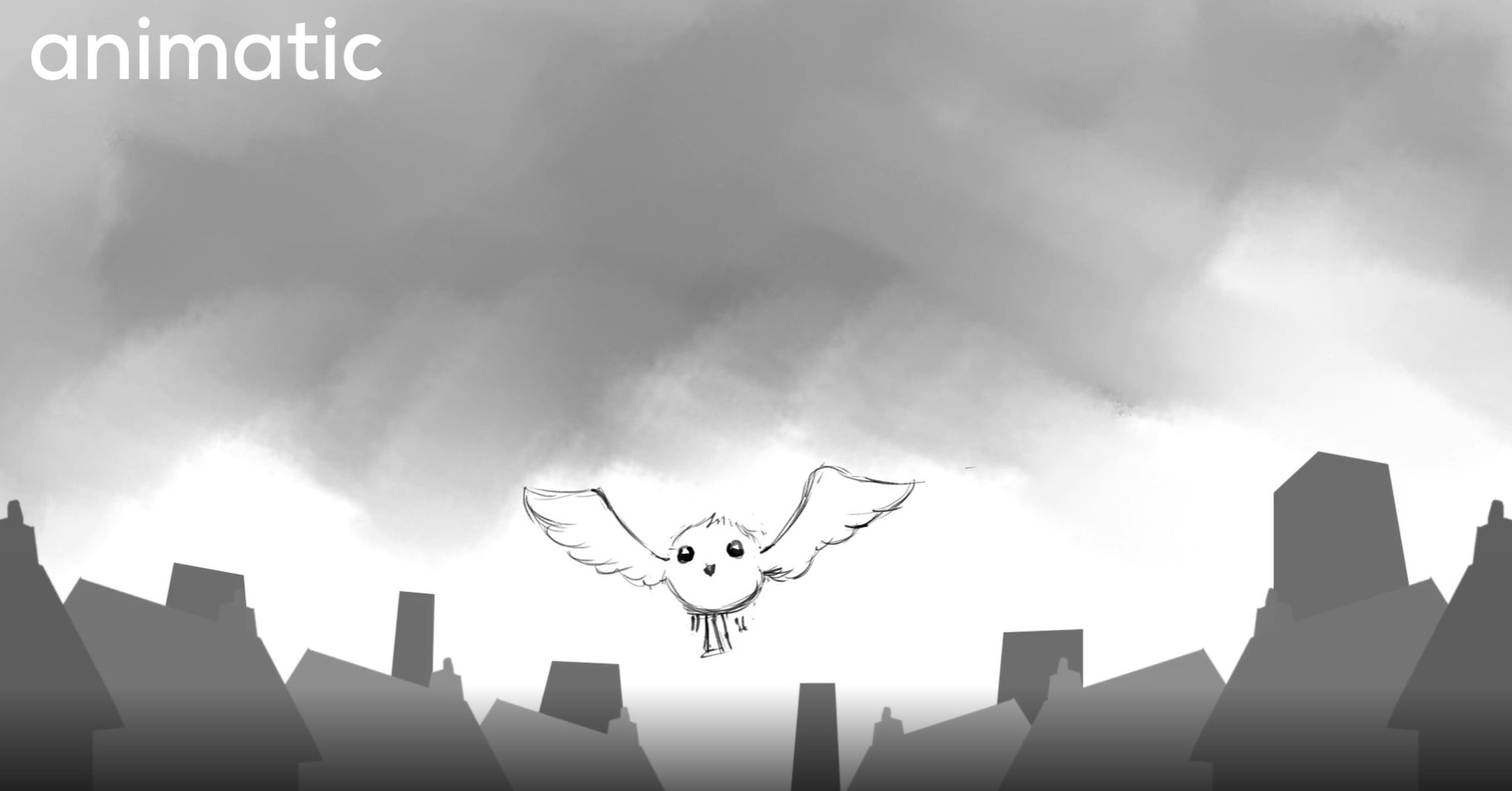
Once we’d settled on a species the next challenge was how stylised to go. It seemed logical to take inspiration from illustrations in the old bird-spotting and Ladybird books of our childhood. There’s a warmth and love of the subject in those images that sat really well with our themes. Many of these used watercolours and that would become a defining characteristic of the whole piece. We let it steer the look of the film as well as our characters.
Initially I was tempted to simplify our characters making them super cute but on reflection a slightly more ‘real’ approach seemed more fitting.
To render the animation we considered the techniques of watercolour artists. Things like large washes for skies, the way colours bleed if the paint is still wet or how masking fluid is used to create clean edges. It’s a media that encourages an illusion of detail because you have to work quickly and let it dry before adding more. If you don’t then the colours can mingle in unpredictable ways. Observing this and other qualities like uneven pigmentation, darker edges and the way the paper grain shows through, we were able to work out how to render the CG.
The texturing of our models was deliberately broad. The few details in them were more like tide marks around blocks of intentionally uneven colour. Most of the look was applied in comp where images were heavily processed. We used some bespoke tools to dial in levels of detail, how flat the colours should be and how much colour bleed we’d apply to the characters. With such an illustrative approach it was art directed much more at this stage than during lighting.
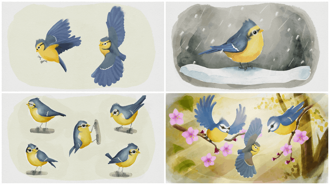
Watercolour process applied to simple CG renders
I don’t usually paint using watercolour but once I started making concept art (with some fancy Photoshop brushes) I quickly realised it’s the opposite to my usual style. I tend to work from dark to light but with watercolour you have to work the other way round. It takes quite a bit of getting used to but the process showed that it would be good to use as much of the artwork in the finished film as possible. We only fully built a few elements in CG using simple geometry to project artwork onto. This meant we could build rich environments without spending months making hundreds of assets and also animate certain elements in 2D.
Next we injected more life by moving the camera and adding atmospheric FX. Finally we ran paper textures through everything and introduced a slight shimmer to approximate real world media. All of this lent a human feel to the spot.
It’s not the first time Aardman has taken a painterly approach to our work by any means. In fact I art directed our first console game ‘11:11 Memories Retold’ for which we developed a real-time shader to mimic the effect of oil paint on glass animation. Each medium you try presents its own set of challenges and watercolour was no exception.
Examples from 11-11 Memories Retold
Although the CG renders were very basic much of the ‘look’ was achieved in comp. We developed a process that took those renders and imbued them with the characteristic of watercolour. This processing and the numerous 3D elements meant our comps could be pretty slow to work with. We ended up pre-rendering certain parts just to keep things moving.
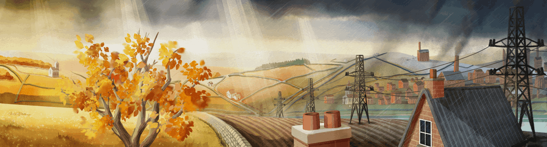
Matte painting projected onto simple geometry
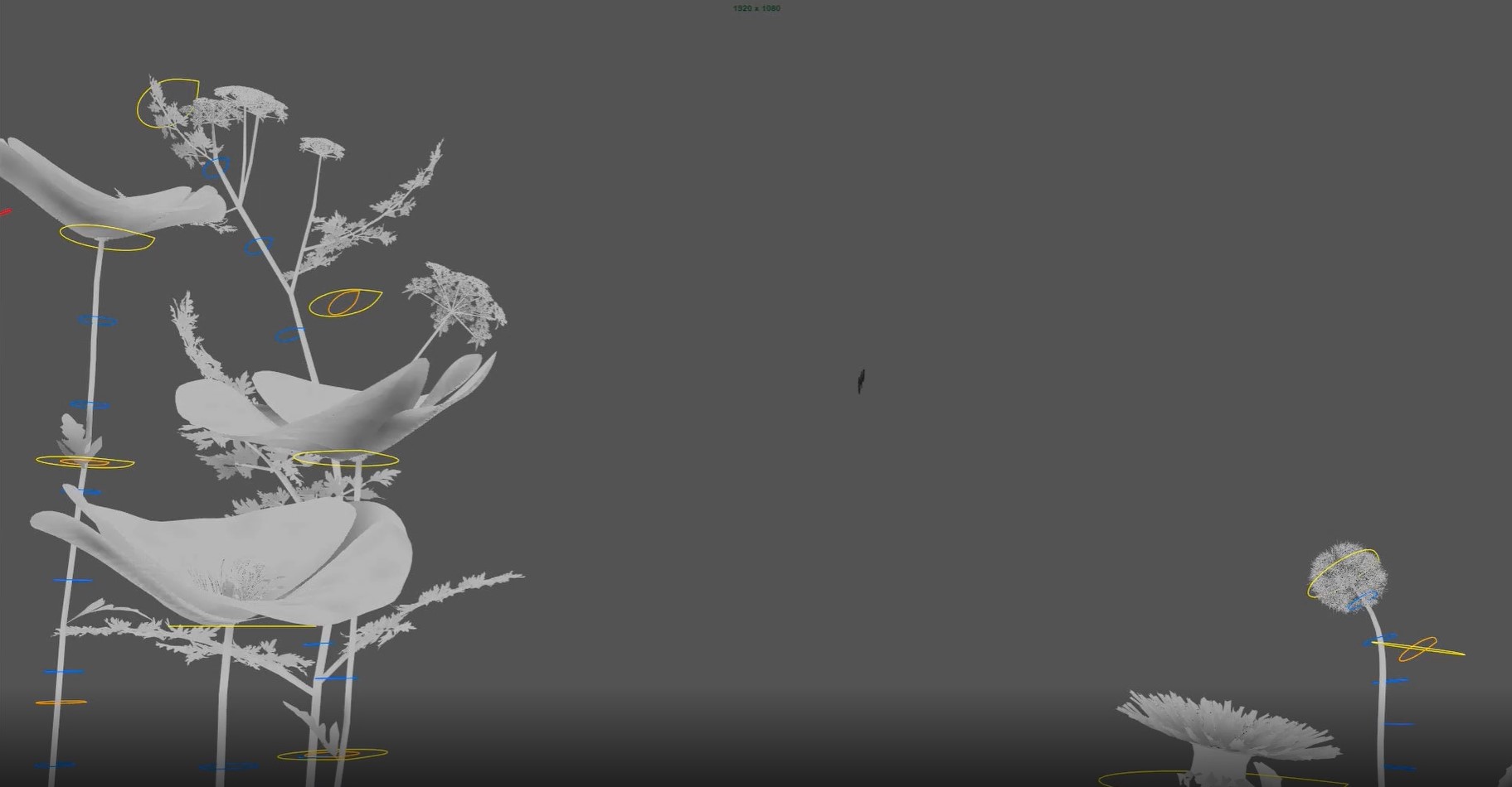
Examples of FX work
A shot with lots of atmospheric effects added in comp
Typical workflow from start to finish
THE ANIMATION
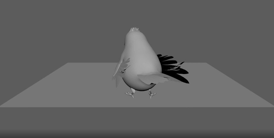
Because our characters had a semi-realistic design it made sense not to push things too far into the realm of cartoons. Our demographic really wouldn’t appreciate it if we anthropomorphised our blue tit too much and it really wouldn’t be in keeping with the narrative. Instead we decided to enhance the ‘handmade’ feel. We approached it with a 2D sensibility despite it being 3D. Although we used Maya to animate we favoured working on 2’s or even 4’s whilst leaning on elegant shapes to add a sense of fluidity. That did mean we broke the rig a few times by pulling it around too much but were able to update it until the very last minute. It’s a fairly simple CG rig but a nice example nonetheless.
Illustrates controls on our bird puppet
‘THE TIMES ARE A CHANGIN’ – CREATIVE FUN
One of the things I took most pleasure in was depicting the passage of time. To show the impact humans have had over the past couple of centuries, we worked on three different levels.
Firstly and most obviously there’s the time-lapse. In the background we show construction happening at vastly accelerated speeds. Most of this was achieved with simple 2D animations but we also used Houdini to create some elements. Blink and you may miss it but as the tower blocks build you can see the insides form before their brick and concrete skins envelop them. Secondly, on a more poetic level we pass through a full year of seasons beginning in summer, passing through autumn and winter before finally returning to spring. It’s the classic ‘pathetic fallacy’ where we use the elements to reflect our hero’s emotional state. The depths of winter nicely illustrate its struggle and the dawn of spring brings a feeling of optimism.
Finally and most subtly we have the seeds of dandelion clocks floating through a number of shots. It’s the sort of symbolism I really enjoy. I like to think this kind of layering rewards repeated viewing.
Shot with all elements
CONCLUSION
It’s hard to choose my favourite parts of the spot, but I do like the opening as well as the part where we move from the countryside to the city through the autumn and into winter. There’s a pleasing tonal shift as we lose sight of the parents whilst concrete and pollution envelop our poor little bird. It’s little moments of storytelling like these that make animation such a joy and the chance to work with talented people for a worthwhile cause is something to be treasured. When they come along, grab them!
Bram Ttwheam
DirectorWith over 20 years’ experience, Bram has worked for a number respected UK animation companies and has contributed to many features and shorts including four BAFTA winners.
Get in touch
Have a similar project you'd like to discuss? Leave your details below:
Related content

From Clay to Coin: The Royal Mint Celebrates 50 Years of Aardman with a 50p
Barbour and Wallace & Gromit have Christmas covered

Crafters Unite for Shaun the Sheep's 30th Anniversary

Nest and Aardman team up for creative pension campaign

System1 and Aardman launch new book on role of craft and character in advertising
Behind the Craft - Wallace & Gromit: Shot On iPhone
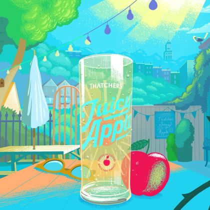
Behind the Craft: Thatchers Juicy Apple
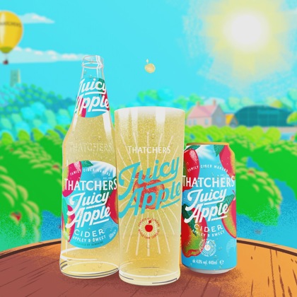
Thatchers Cider and Aardman collaborate on juicy new campaign

Behind the Craft: Darcy's Tale
Aardman film spotlights groundwater flooding in new national initiative

Behind the Craft: Shaun the Sheep x Lush

BBC unveils exclusive Wallace & Gromit themed Christmas idents
Festive Shaun the Sheep animation celebrates Save the Children’s Christmas Jumper Day
Barbour and Shaun the Sheep return with 2024 Christmas film

Holding attention: Three campaigns that kept fans hooked
Aardman brings back Farmer and Rancher in campaign for McDonald's France
Aardman and Thatchers Cider collaborate on new campaign

Crafting Stop Motion Magic with VR Technology